
COMOTION
2025.
CoMotion is SCAD’s annual student-led motion design conference. For the 2025 edition I directed the visual direction behind its opening film and identity, built by a team of 39 across more than 100 deliverables.
Concept Development
Motion Direction
Design Guide
Title Card Framework
Event Identity
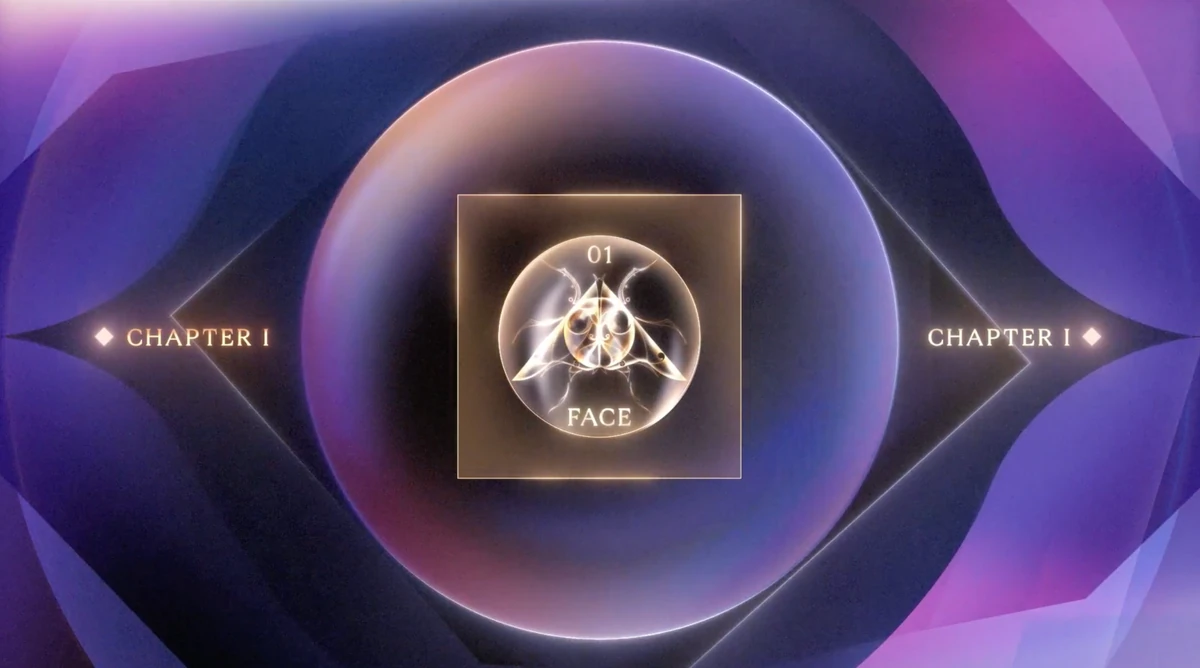
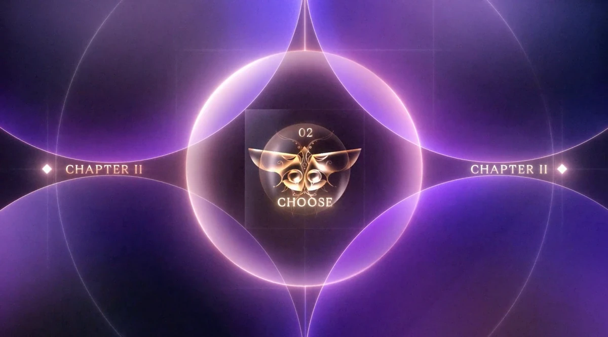
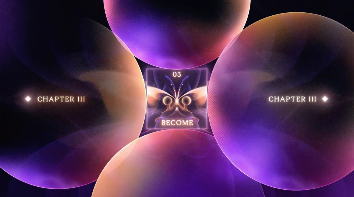
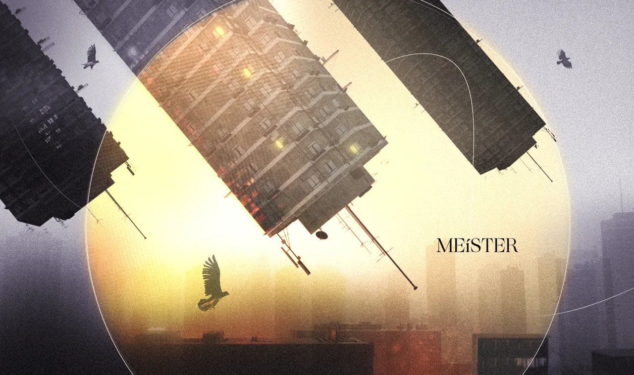
Face, Choose, Become opened CoMotion 2025: three beats, one story, one identity in motion.
SHOT NOTES
MOTION REVIEWS
CoMotion 2025 was the conference’s 16th edition, a two-day event at SCAD Savannah that opened on February 28 under the theme “Light the Way.” The film took that theme and turned it into a story: facing the unknown, making a choice, becoming something new. I reviewed shots with the team and gave notes on glow, light and composition until the sequence read as one film.
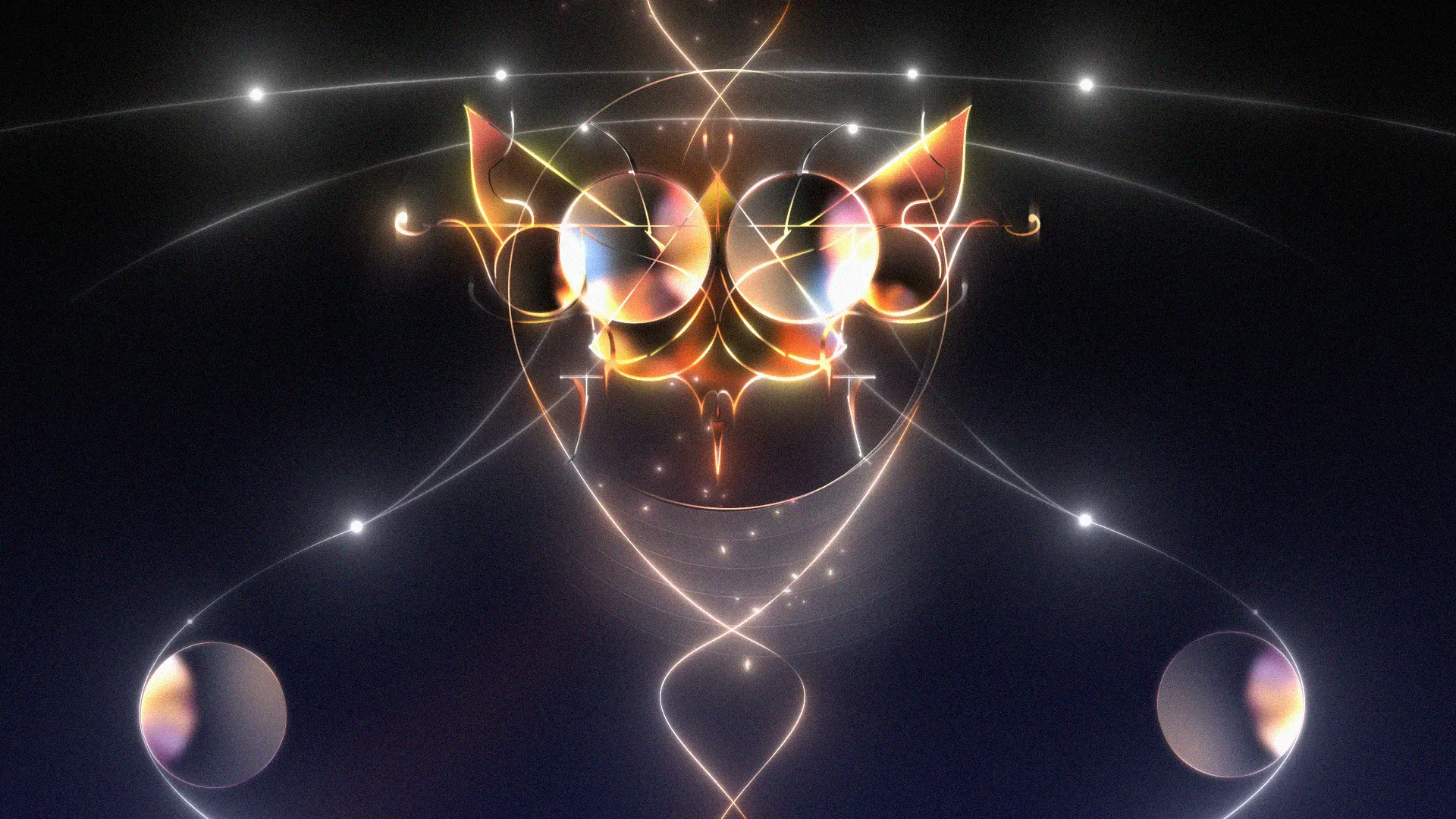
A moth is drawn to light, so it fit “Light the Way” naturally. We used it as a metaphor for the creative process, not just a creature flying toward a lamp.
CHOOSE
BECOME
Being drawn toward something, facing uncertainty, making choices, becoming something new: that arc became Face, Choose, Become. The pitch styleframes and 3D assets were mine, with Rivai supporting, and once the direction was selected the team built on those files. From there we abstracted the moth into geometry, lines, light and motion, so it could work as a system rather than a single character. The idea of decoding stayed in the story, while the early symbols were simplified into that same language.
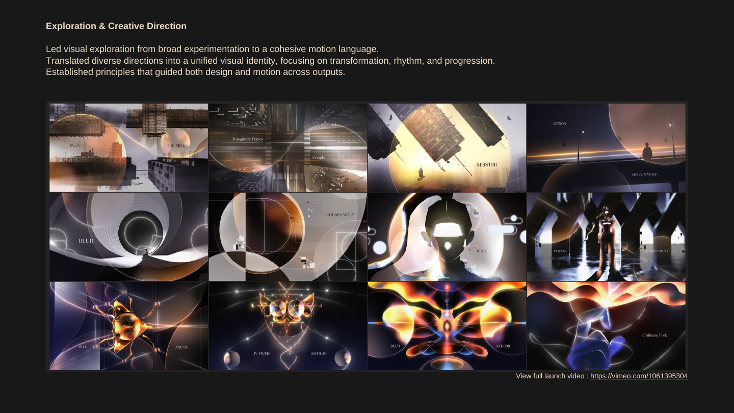
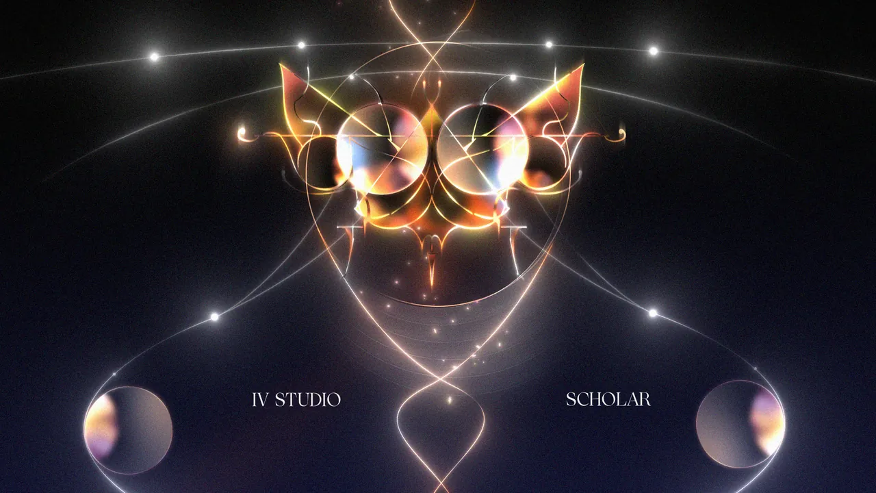
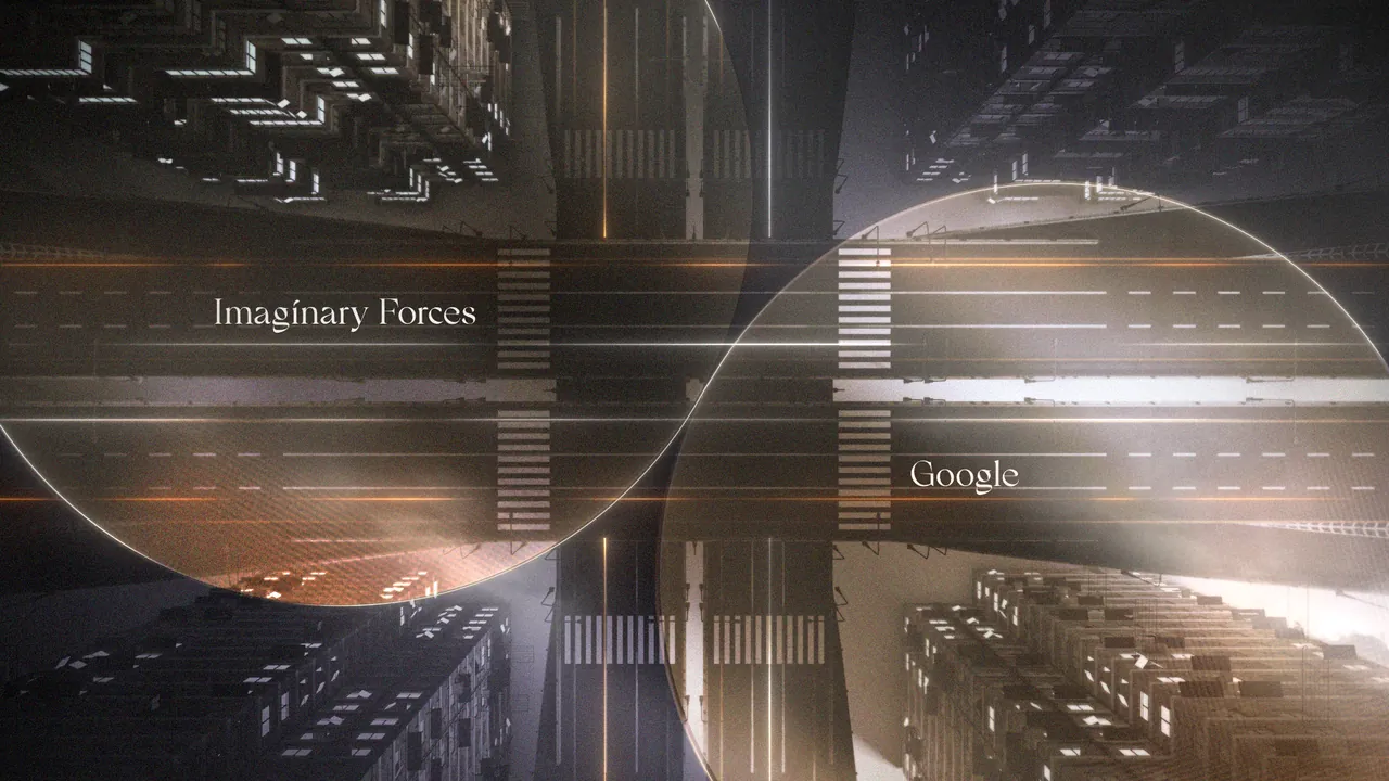
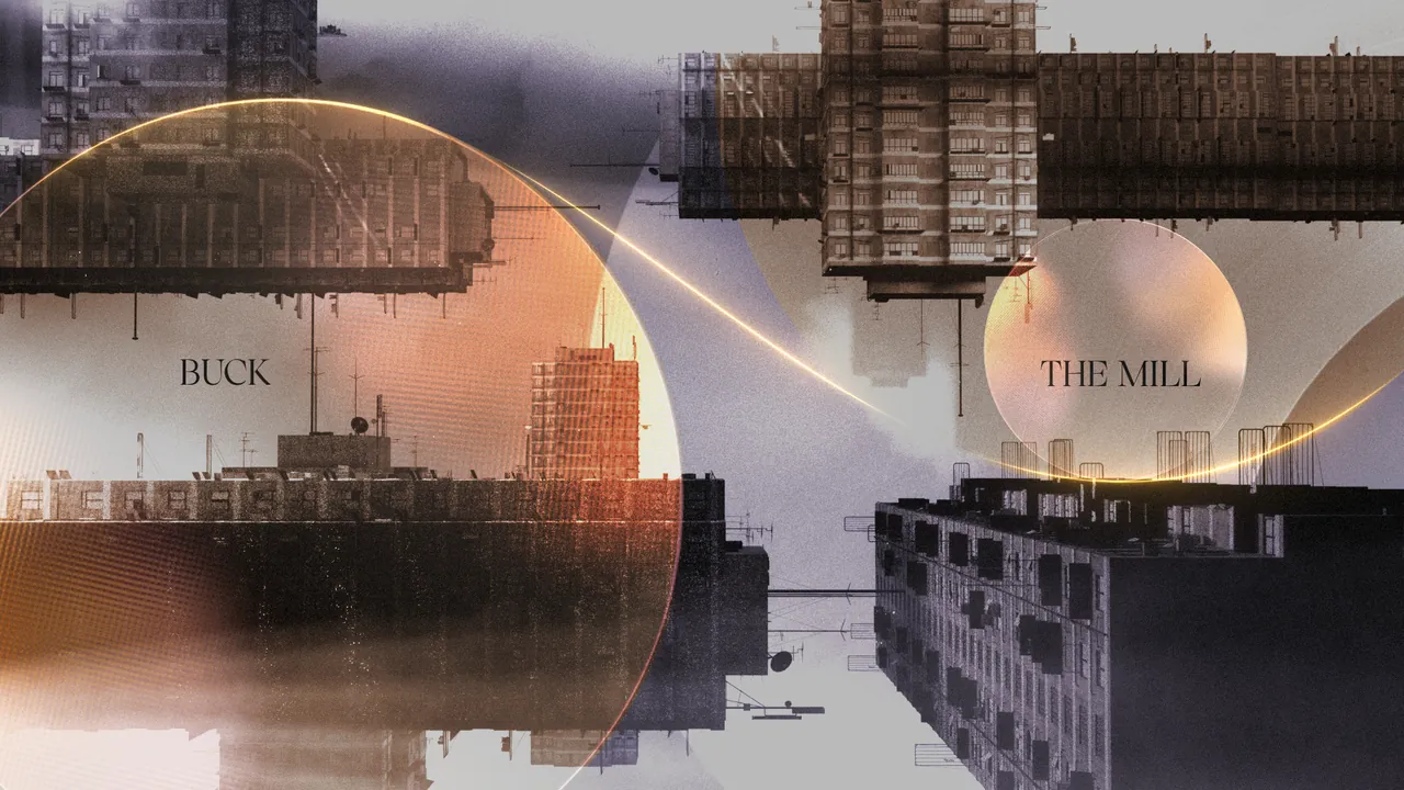
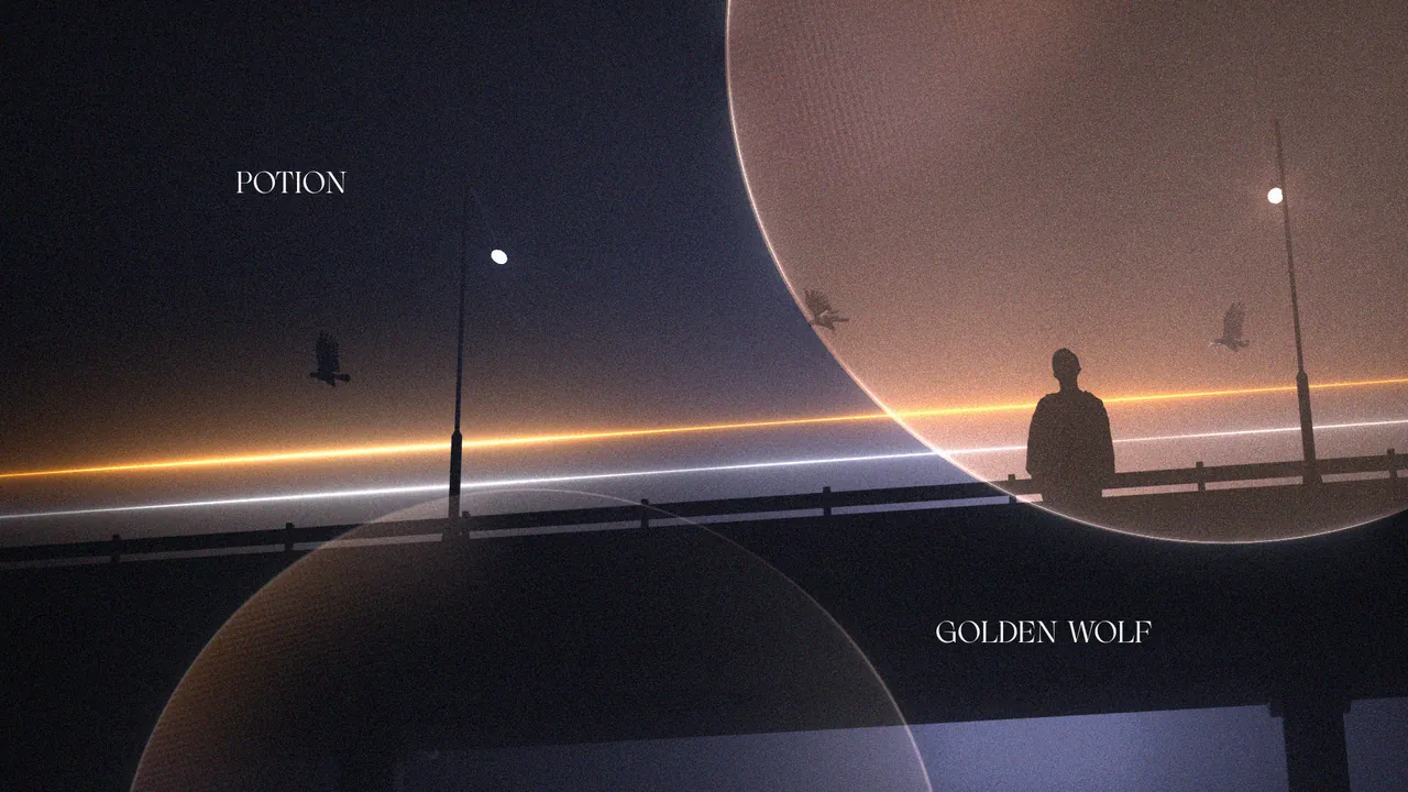
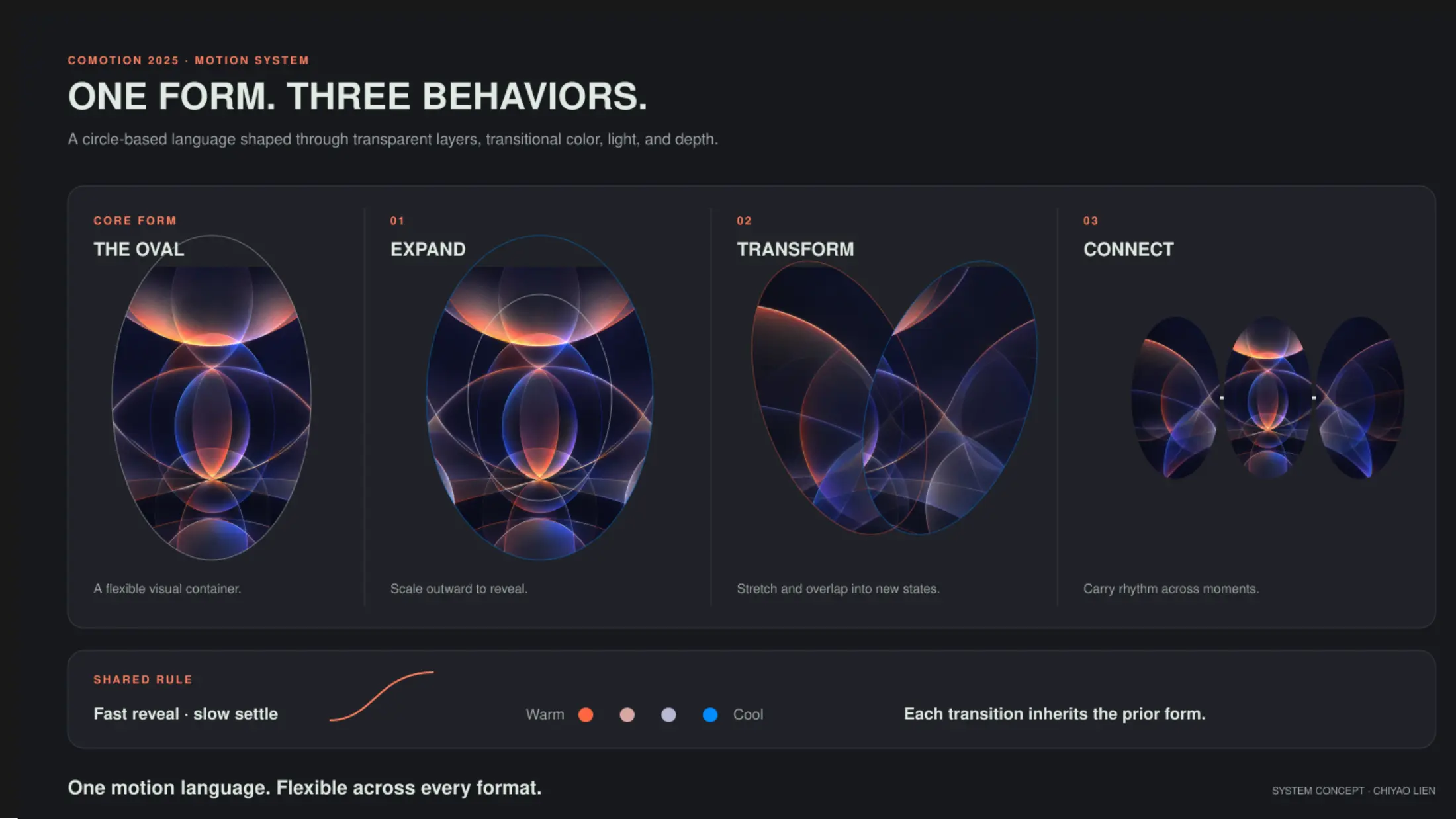
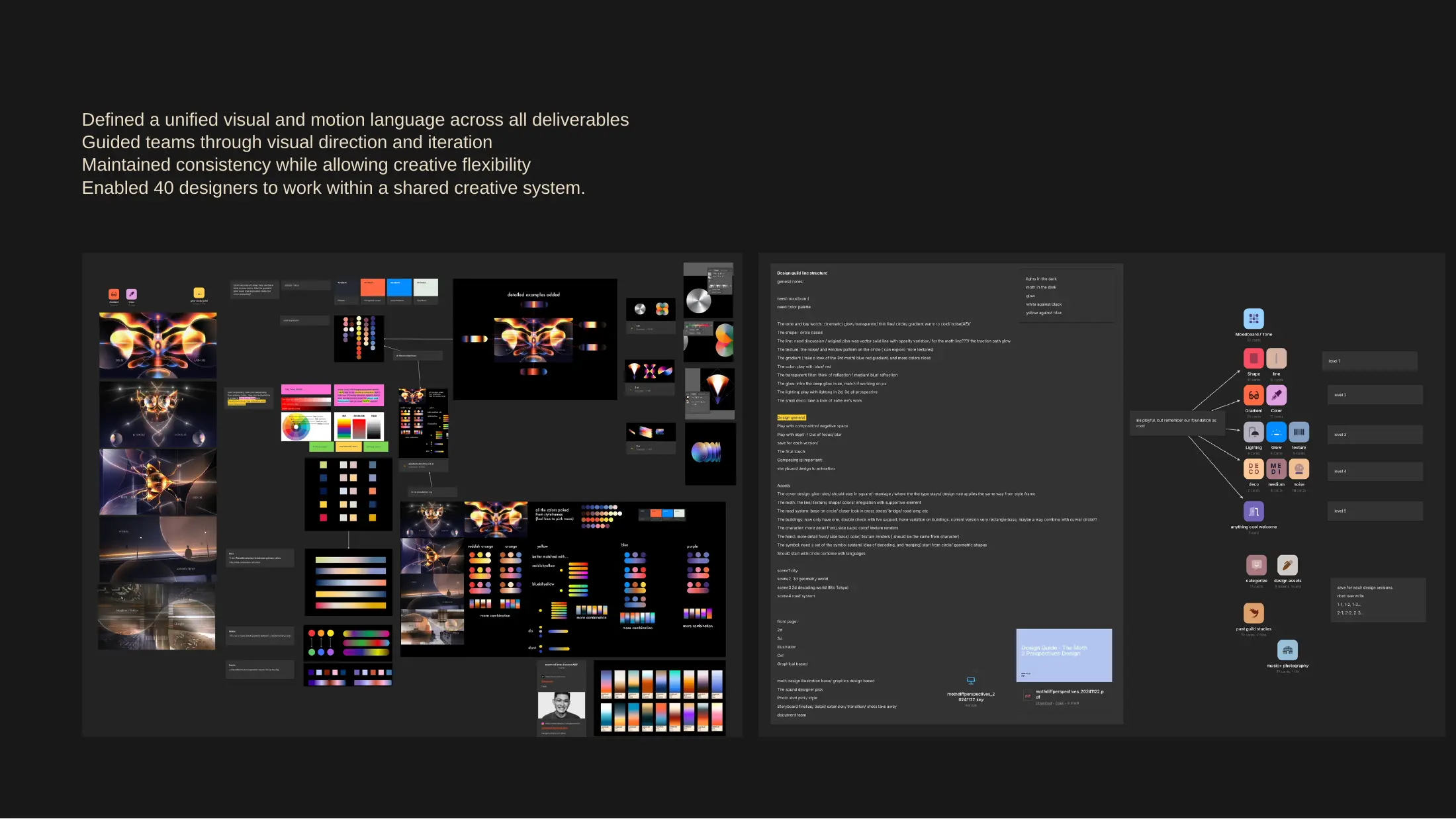
With 39 people contributing, the guide had to be small enough to remember and strict enough to hold.
LINE: THIN
LIGHT: GLOW
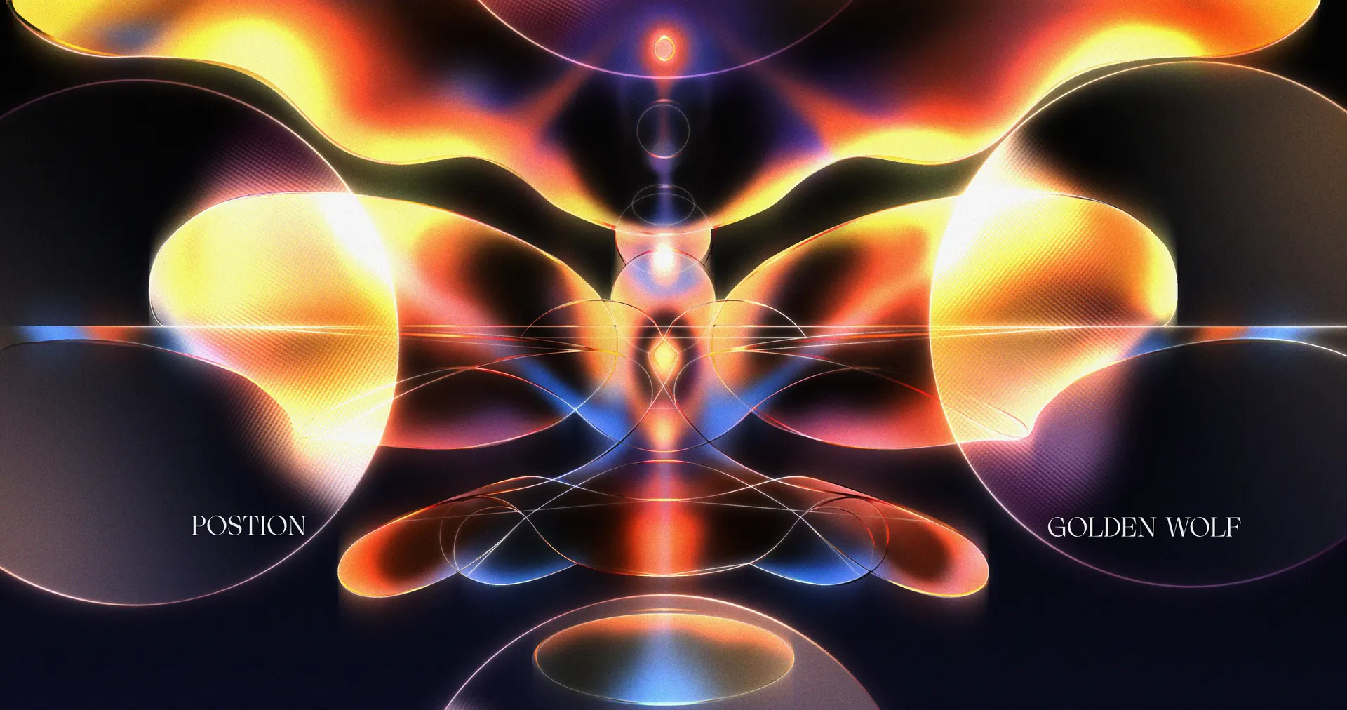
The rules were circle-based shapes, thin lines, controlled gradients that run warm to cold, transparent layers, and glow with depth. We used the same rules to review work: whether a frame fit the system, held its hierarchy and composition, stayed light on density, and connected to the shots around it. My own notes were mostly about restraint: drop the mosaic, shrink the glass texture, let the glow breathe instead of sitting flat, thin the curve, bring the white highlights down by about 30%.
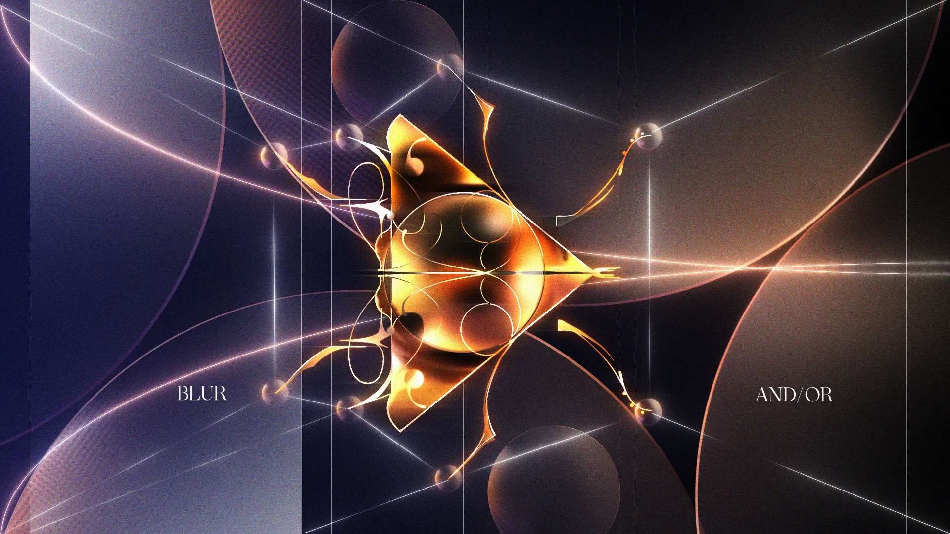
Every title card sits on the same frame: shared typography, palette, framing and reveal logic, so many hands read as one sequence.
PALETTE
FRAMING
REVEAL
We narrowed the type to Systemia and Iskry, and I argued for Systemia: its geometric, Swiss logic suits the shapes, and it echoes decoding, which gave us a base for the symbol thinking. When designers brought options back to me, I picked one and said why, so the next person could apply it. Notes were specific: more glow, thinner lines, cleaner compositing.
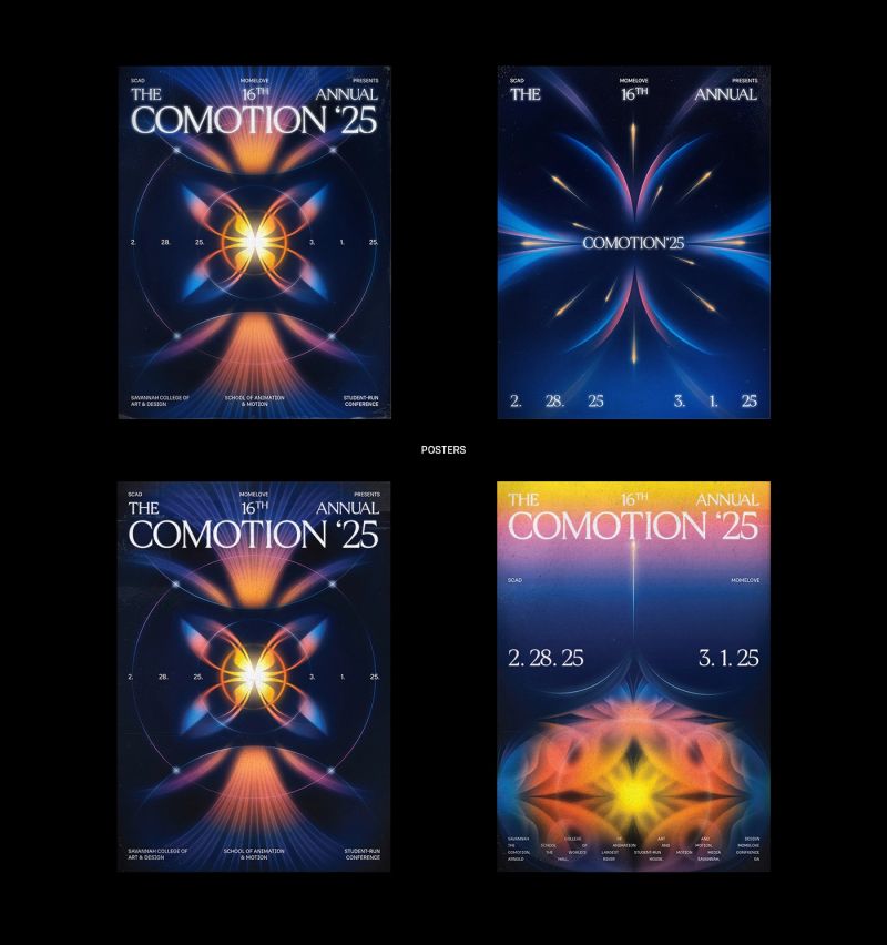
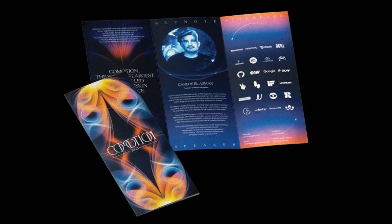
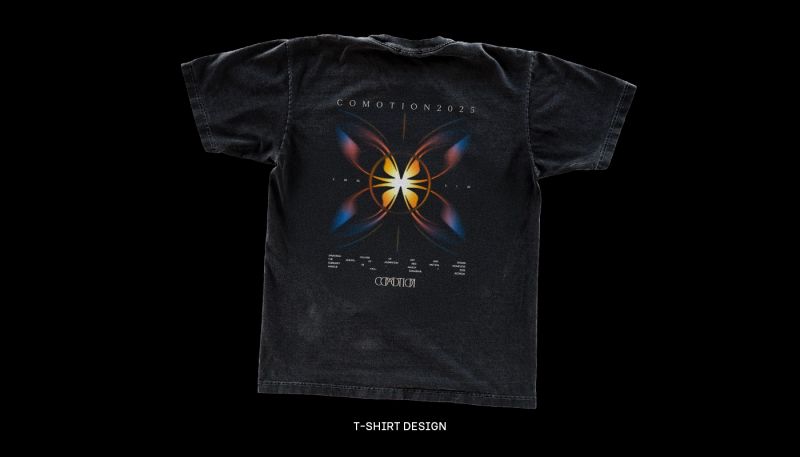
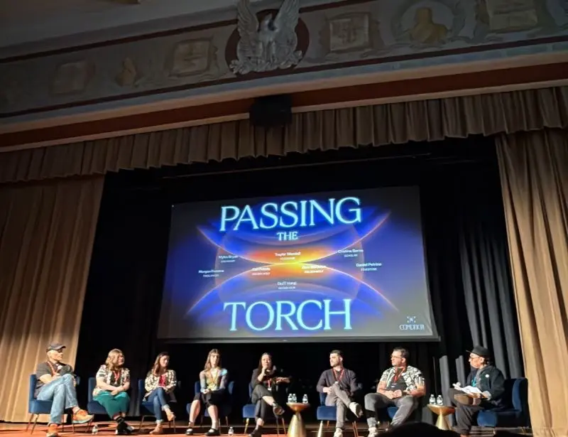
The identity ran across more than 100 deliverables with a team of 39, and the title sequence won an Applied Arts award.
MOTION · SINGLE
WINNER
The opening was presented to emerging designers and visiting industry professionals, and the conference was covered by Motionographer ↗. For me, the clearest result is that 39 designers could contribute and the work still read as one visual system.
Creative Directors: Chiyao Lien, Rivai WZ Li · Producers: Lola Coleman, Annalise Kristensen · Lead Animation & Post: Gage Bowman · Design Lead: Jinkyu Kang · Design Art Director: Jieru Tang · Lead Graphic Designer: Brooke Niblock · Graphic Design Art Director: Wildy Riftian · Experiential Lead: Eleanore Matthews. Full team credited in the film.